
The art elements are as follows: line, shape, form, space, texture, color, and value.
LINE
Line are marks that go from one area to another. Lines can be used to make up different things such as a house or a person, or line can be used to direct the viewer's eye from one space to another.
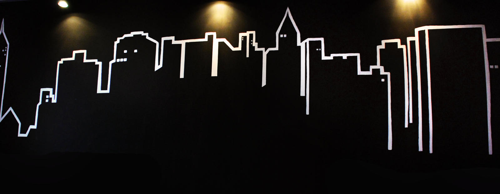 |
| Image from: http://alajwakh.com/cityscape-art-lesson |
This picture is an example of both uses. The lines are used to make the shapes of buildings, and the line directs our eyes from the very left to the very right.
SHAPE
Shape is the form of something. Common shapes are squares, circles, rectangles, triangles, etc. They are often only two-dimensional.
For example, the picture below is composed of many triangles.
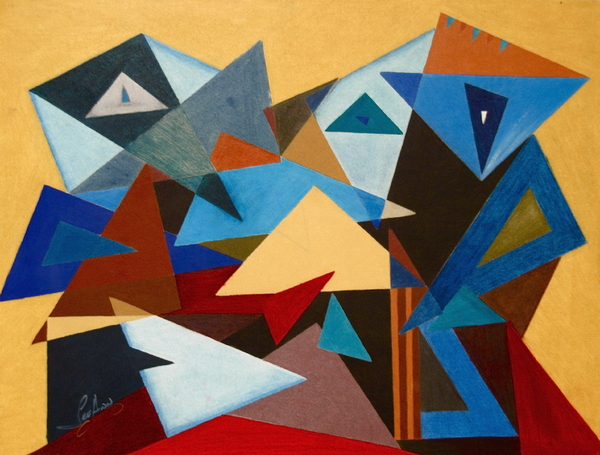 |
| Artist: LeeAnn Alexander Shapes can also be used to make something out of, such as the picture below. The artist uses rectangles and squares to make these blocky people. |
 |
| Artist: Pablo Picasso |
FORM
Form is the depth, length, and width of something and is three-dimensional. Essentially, it is the same thing as shape but it is not flat. A cube is the same thing as a square except one is 3D and one is 2D. Form, also, does not have to be a specific shape.
 |
| Artist: George Platt Lynes |
see his form. He does not look two dimensional in the slightest way.
SPACE
Space refers to the area in which the art is organized; there can be positive space (something) and there can be negative space (nothing).
An example is this pear painting. The fact that the pear is centered in the middle is how the artist decided to use space. Whether it is in the middle, the left, the right, or anywhere in the picture is space because that is the area the artist organized it into. The pear is an example of positive space (there is something there) while the black background is negative space (it is empty).
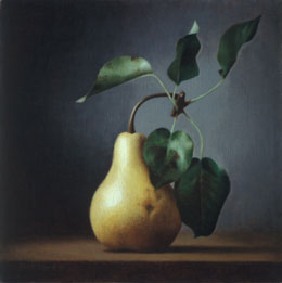 |
Artist: Leah Kristen |
TEXTURE
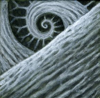
Texture is how the surface in the art looks and how it would feel to touch. This could mean that it is actually this texture or it is implied to be this texture.
For example, in the picture below, the texture of the actualy painting is rough and parts of it do actually stick out. This texture was created by the use of thick paint and blotching it on while smoothing out other areas.
 |
| Retrieved from http://www.edtech.vt.edu/edtech/arthistory/texture/texture.html |
 |
| Artist: Jeff Johnson |
However, in the picture above, this texture may appear to be bumpy and rigid, but it is not.
COLOR
Color is Toin almost every art work. Colors come from the three primaries (red, yellow, and blue), black, and white. They also have three properties which are hue, value, and intensity. So even though color is in almost every art work, it's how the artist uses the colors that's really important.
 |
| Artist: Henri Toulouse-Lautrec |
In the picture above, the artist uses a lot of reds and some oranges which are "warm" colors. This best suits the content of the painting because it is of a couple kissing and it wouldn't be very romantic if that was "cold" (blues and greys).
VALUE
Value refers to the lightness and darkness. The lightness and darkness create various levels of contrast.
In the picture below, for example, you can see the darkness of the shadows and the lightness of the highlights.
 |
| Artist: Edward Weston |
No comments:
Post a Comment