
We did many various site seeings, such as a Rhode Island lighthouse cruise, a tour of the William Gillette castle, and a trip to two Indian casinos (though I was too young to gamble!). Oh, and, of course, a relaxing day spent at the Atlantic Ocean! Because there are so many pictures, I decided to split them up into two posts. This one will include pictures of the lighthouses, oceans, and a few extra pictures that don't necessarily fit into any of the categories. The next post will have some of the Indian Casinos and of the castle.
As for taking pictures at a fast moving speed, play with the settings on your camera. There should be one for action or a moving subject. I found this very helpful. And remember, take MORE THAN ONE picture! I must have taken fifteen or so of each lighthouse just to ensure that one would look decent. When you're on a cruise, or taking a picture of something that is moving away, you don't have much time to check and see if the picture you took was okay. You just have to keep snapping.

My intention while editing this picture was to make it look very old and very eerie. Even before it was black and white, it reminded me of that lighthouse from The Ring. I'm not sure why, but I wanted to bring out that perspective through the editing.

To the right is the Beavertail Lighthouse. As stated before, it helps to have an excellent zoom on your camera. Also, take note of the waves clashing against the rocks. That adds a little detail that may be overlooked, but it makes a better picture overall because you are capturing motion. When you take more than one picture of the same thing, you notice that they aren't always exactly alike. In other pictures I took of this lighthouse, not all of them had waves crashing. That's the beauty of the ocean; it never sits still and is always changing. Once again, and I know this sounds repetitive, take more than one picture!
 To the right is the Plum Beach Lighthouse. A little interesting fact is that it is actually solar powered. The bridge in the background isn't merely just a background, but it also contributes to the whole photo; it provides line --one of the elements of art. Take advantage of these natural elements that present themselves! Also, it would appear in this photo that it was dusk, or at least not very sunny. That, in fact, is not true. It was so sunny that I got a horrible sun burn! With editing, you can alter the lightness and darkness and you can fool the viewers into thinking it is a false time of day. On a side note, isn't it beautiful how the sunlight makes the water sparkle? You could even enhance these highlights through editing.
 To the left is a small lighthouse, and I'm actually unsure of the name. If I remember correctly, it wasn't one of the main lighthouses on the tour, just an extra side bonus. I could have waited for the boat to pass (and I actually had a couple pictures without the boat), but I felt it added to the picture. It may be distracting from the main focus of the lighthouse, but I guess that is all a matter of opinion. In meaning, what would a lighthouse be without a boat? Thus, I felt the two went together nicely. This is an example of the art principle unity. It's not just a picture of a lighthouse, and it is not just a picture of a boat; both are present to represent a whole.
Below is a picture of the Wale Rock Lighthouse remains. It was destroyed by a hurricane and never rebuilt.
Again, it looks like dusk with the pink sky, but it really isn't. It's all in the magic of editing. Notice also the waves crashing and the glimmers in the water. As stated in a prior blog post, the focus of the picture does not have to be centered.


 To the right is Fort Adams. Though it is not a lighthouse, it was still highlighted on the cruise. It was an extraordinarily long building (the second largest masonry fortification in America), and hard to capture all in one frame. So I decided to take the part I could in an angle. The majority of the picture is sky and water, the main subject is still Fort Adams.
 To the right is an under view of one of the Newport Pell Bridge. I find this picture extremely interesting because it is not often you get to see under a bridge that goes across the ocean; you mostly just see the top you drive over or the side. Upward angles make great photos.
  To the right is the Jamestown-Verrazano Bridge. This picture is pretty monochromatic --it is all shades blue and then white. Though the bridge, of course, is actually gray, it was altered just by adjusting the color temperature. I also think that the slanting of the bridge added a nice touch to the picture, though that was a completely independent factor; it was going to be slanted whether I wanted that or not.
  To the right is the same bridge as directly above, but the view from on top. I thought it was the neatest thing that the bridge had hills. I was amazed by the architecture. My mother, on the other hand, wouldn't open her eyes while we drove on these bridges because she's afraid of driving over water.

Maybe it is just because I've always been easily entertained by the little things, but I feel it's important to not overlook anything. For instance, even though the cruise was for the extraordinary and extravagant lighthouses and buildings, I saw these ordinary water buoys and I thought they'd make excellent pictures. The one on the left is very dull, and the water is gray. It is also only of the buoy floating in the water. The one on the right, however, is bright and vibrant while the background of the city behind it is dull colored. These color schemes were intended, and it goes to show that no matter how simple the subject is, a variety of things can be done.
 To the left is an inflatable tow boat and I thought it was the absolute cutest thing I have ever seen. I loved the bright red, and that contributed to the vintage factor I was trying to bring out in quite a few of these pictures. This boat makes me think of the original black and white Mickey Mouse where he is steering the boat. Again, like The Ring lighthouse, I'm not quite sure why. Also, the vibrant greens really enhance the photo nicely. Because both colors are vibrant, and both are complementary colors, they combine nicely. Below is the same picture, but cropped and in black and white. Because it is zoomed in and color is out of the equation, you notice more detail such as the waves or the texture of the rocks.
 In the picture to the right, it is the same tow boat but closer. Now you can read some of what is on the boat and see more detail. I still kept the colors vibrant. Also, I enjoy how you can see the boat actually lifting off of the water from the waves. Movement in photographs can be wonderful.
 To the left is a sea of boats. During the cruise, we got caught in some boat traffic. It was an inconvenience that turned perfect because the ship was now only going 5mph and there was much to look at and enjoy. The closest boat is the U.S. Coast Guard. The other boats provide a nice background for the Guard.
 Back on solid ground, these are pictures I took before and after the cruise. This is a picture of a stone boardwalk for either walking across or fishing. It provides a nice line. Also, I wanted a bit of the grass in the picture to provide more layers.
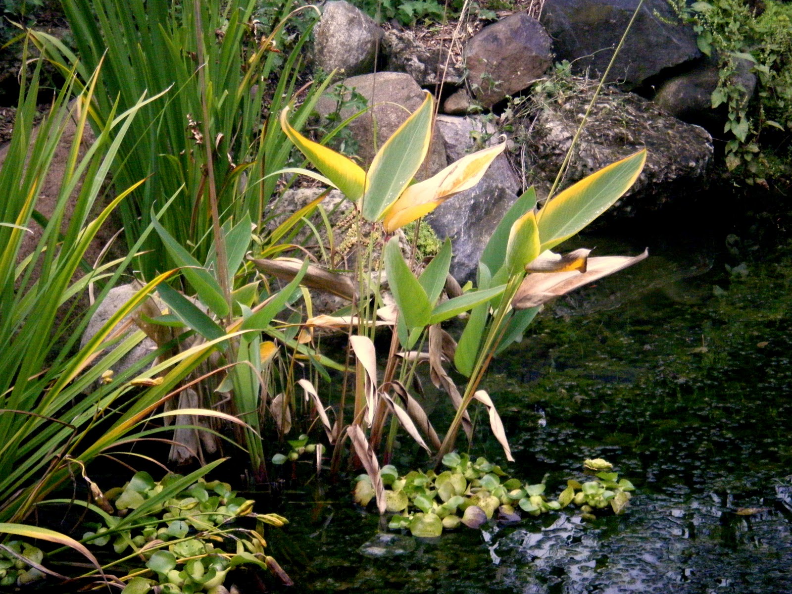
 The pi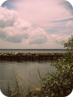 cture to the left is the same boardwalk, but I moved over a few feet to incorporate more plants and a rock. The tall plant on the right side serves as a sort of border and provides layering. The trick to taking this picture and the one above was getting low to the ground as if I was someone -or something- very small and I had to peek over and around the plants to see the ocean and boardwalk. It lures you in and the ocean and boardwalk seem like it's something secret and hidden, but you've just discovered it.
 cture to the left is the same boardwalk, but I moved over a few feet to incorporate more plants and a rock. The tall plant on the right side serves as a sort of border and provides layering. The trick to taking this picture and the one above was getting low to the ground as if I was someone -or something- very small and I had to peek over and around the plants to see the ocean and boardwalk. It lures you in and the ocean and boardwalk seem like it's something secret and hidden, but you've just discovered it.
  On the back of the cruise ship, there was an American flag that hung down. I incorporated this into the picture of the ocean for a patriotic spirit. Being in one of the original thirteen colonies already made me feel very patriotic as it was, so I thought this picture would be a nice reminder of that feeling.
 The picture to the right has a vintage feel to it that I absolutely love. Everything is colored a bit more dull than it actually was, and the fencing adds for a great design. The brown bottom of the photo is actually just the rusty dock to board the ship, but it almost looks like a sandy beach or dirt.
  To the right is another photo I had to get low on the ground for. I saw the duck and I wanted a picture of that, but I didn't just want to take a plain ol' boring picture of a duck. So I included the rocks and grass to provide a bit more substance and a boarder.
  Lastly, to the left is a picture of a seagull. I always love capturing pictures of birds up in the sky. What I love even more is the tall grass that spikes it's way from the bottom of the picture. I was low to the ground, once again.Getting an upward angle like this makes it seem as if the bird had just lifted off from the ground.
Throughout these pictures, I tried to convey a vintage feel to the majority of them. I suppose that is because being in a New England state makes me feel old fashioned. Not only did I play with the lightness, darkness, temperature, etc., but I also rounded out the corners. A great and FREE picture editing tool to check out for this is http://www.picnik.com/app. Unlike Picasa, no download is required. What really sold me on this application was the great variety of effects they offer, one being a 1960's effect! Vintage!
If you are in Rhode Island, close to, or thinking about traveling there, I definitely recommend the Lighthouse Cruise! It was not very expensive, they do day and dusk trips, and the tour guide is wonderful. To check out tickets or just more information on the lighthouses and other attractions, visit here: http://www.rhodeislandbaycruises.com/About.htm
Again, I mentioned briefly the Art Elements and Principles. For more information about those, check out: Art Elements and Art Principles
Thank you for reading, and comments/feedback is welcomed!


